Manga art styles: six illustrated approaches for your story
Compare six manga art styles with original illustrations. Learn how linework, shadows, proportions and color change a scene, then write your own art brief.
Your manga's art style comes from repeatable choices: line weight, proportions, shadows, texture and color. Compare six illustrated approaches below, then write a brief you can use across a whole chapter.
One scene, six visual approaches
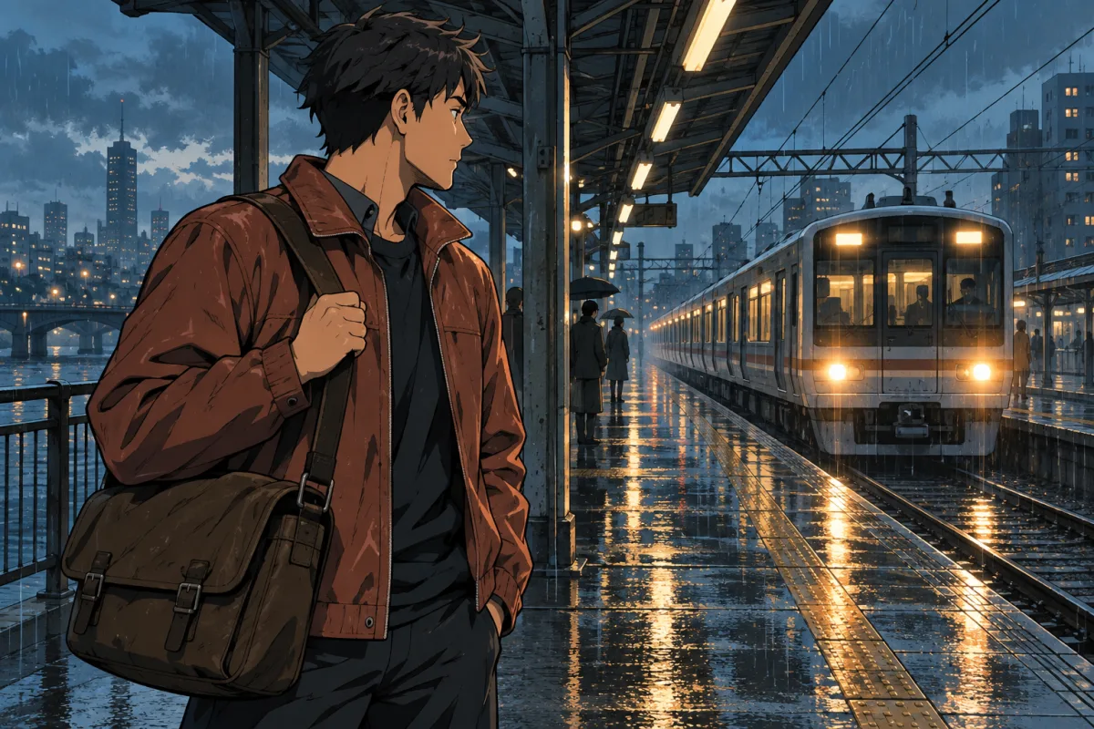
Each example starts with the same scene idea: an adult courier waits on a rainy railway platform, holding a satchel as a train approaches. Notice what happens to the mood when the rendering changes.
These original AI-generated illustrations were made for this guide with an image-generation tool. They are editorial examples. Konyomi's public manga creation is still in early access. The images were generated independently, so faces and framing vary.
 01 · Clean linework and screentones
 02 · High-contrast action
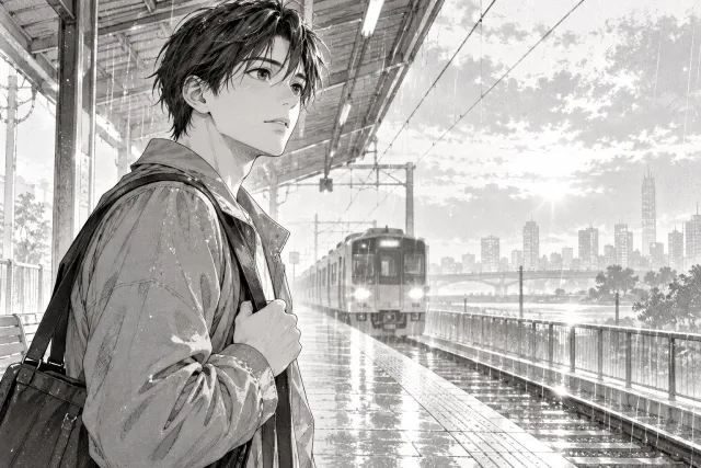 03 · Delicate, expressive linework
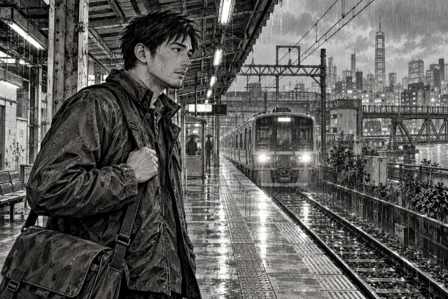 04 · Realistic proportions and ink texture
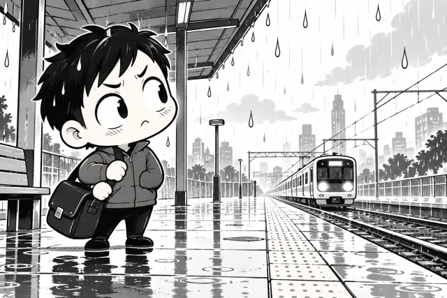 05 · Chibi and comic exaggeration
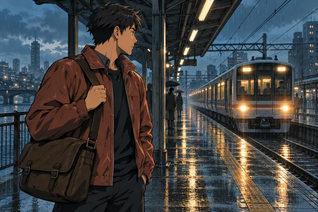 06 · Cel-shaded color
These are practical descriptions of rendering choices. Artists can combine them; they are not an official list of manga categories.
Shonen and shojo: audience, genre and art style
Shonen and shojo are publishing labels associated with readers. VIZ explains that both also appeal across age and gender. Its overview describes shonen as often action-oriented and shojo as often focused on drama and relationships. Those tendencies leave room for many drawing approaches.
Separate three decisions in your brief:
- Audience: Who is the story written for?
- Genre: Is it a mystery, romance, fantasy, sports story or something else?
- Rendering: How do lines, proportions, tones and colors make the story feel?
A romance can use bold shadows. An action story can pause for delicate expressive faces. Describe what should appear on the page instead of relying on a publishing label alone.
1. Clean linework and screentones
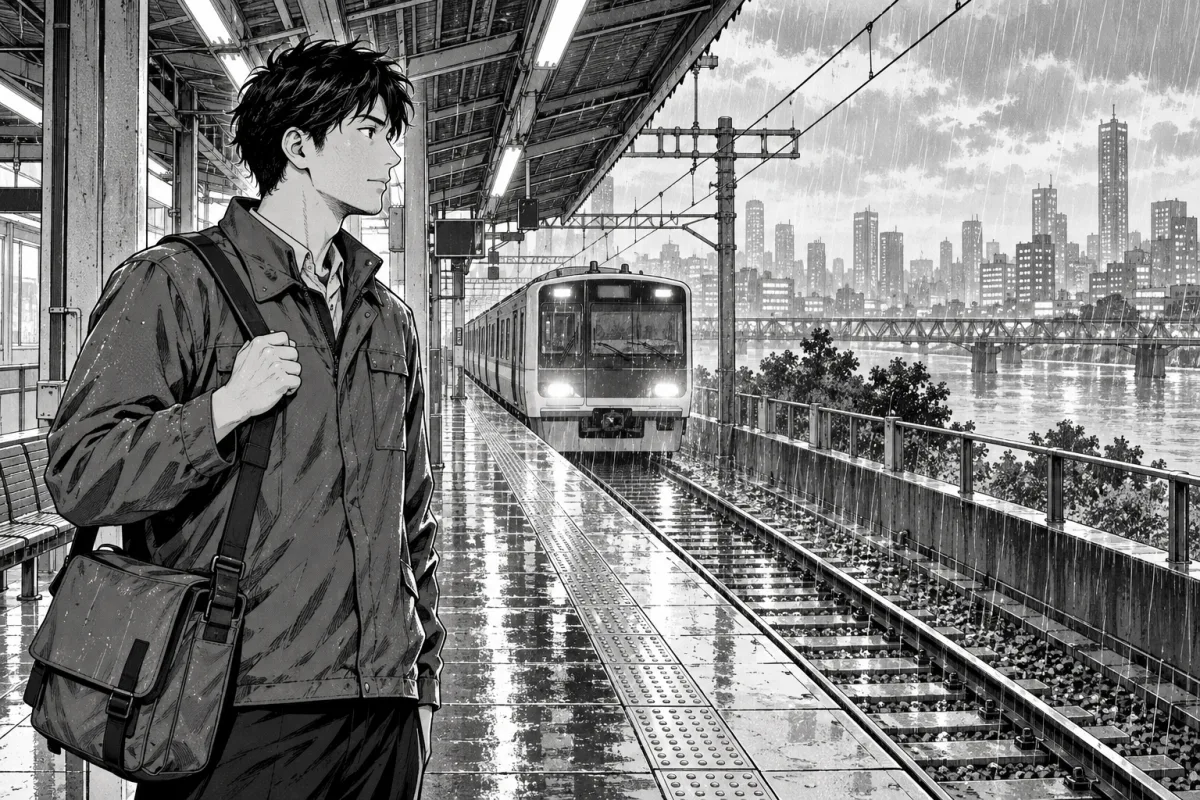
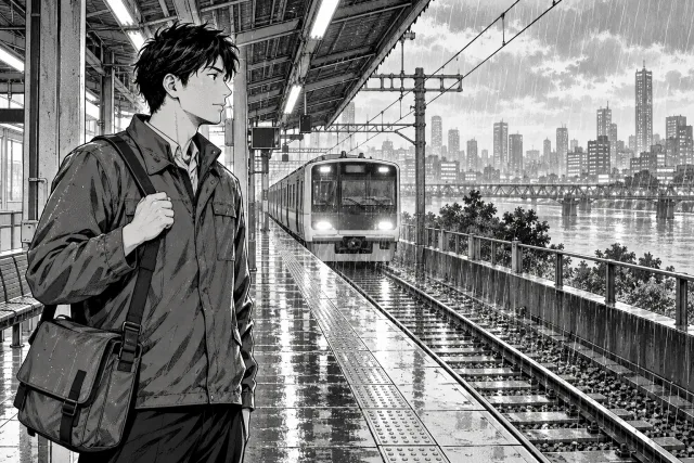
A line-led approach keeps silhouettes clear and uses screentones for areas between black and white. Screentones are patterns, often dots, whose density changes the apparent shade. In this example, the darker satchel anchors the foreground while the lighter train stays easy to read.
Try this for a dialogue-led adventure or everyday scene where readers need to follow faces, props and locations quickly.
Watch for: Fine patterns can become muddy or produce interference when resized. Check the actual page at its final reading or print size.
Art brief: Crisp ink contours, restrained halftone shadows, readable silhouettes, clear separation between foreground and background.
2. High-contrast action
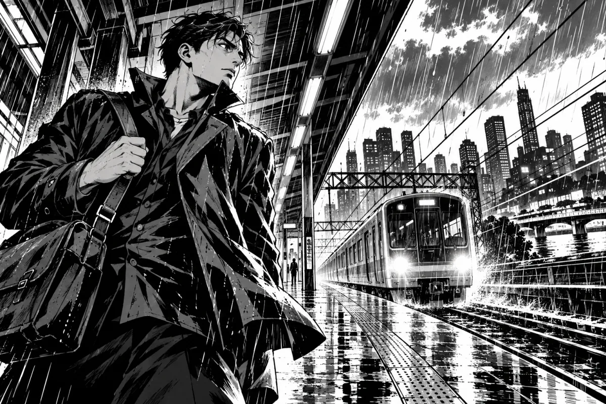
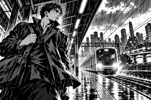
Heavy shadows and varied line weight give this scene more force. Directional marks pull the eye toward the train. You can use the same visual language for a chase, a sporting clash or a tense arrival; the story decides what the emphasis means.
Try this when the page needs a strong focal point, sudden movement or a clear change in tension.
Watch for: Too many dark shapes or competing lines can hide the action. Keep the main gesture readable before adding effects.
Art brief: Bold varied ink weight, graphic black shadows, directional motion lines, dramatic perspective, one dominant gesture.
3. Delicate, expressive linework
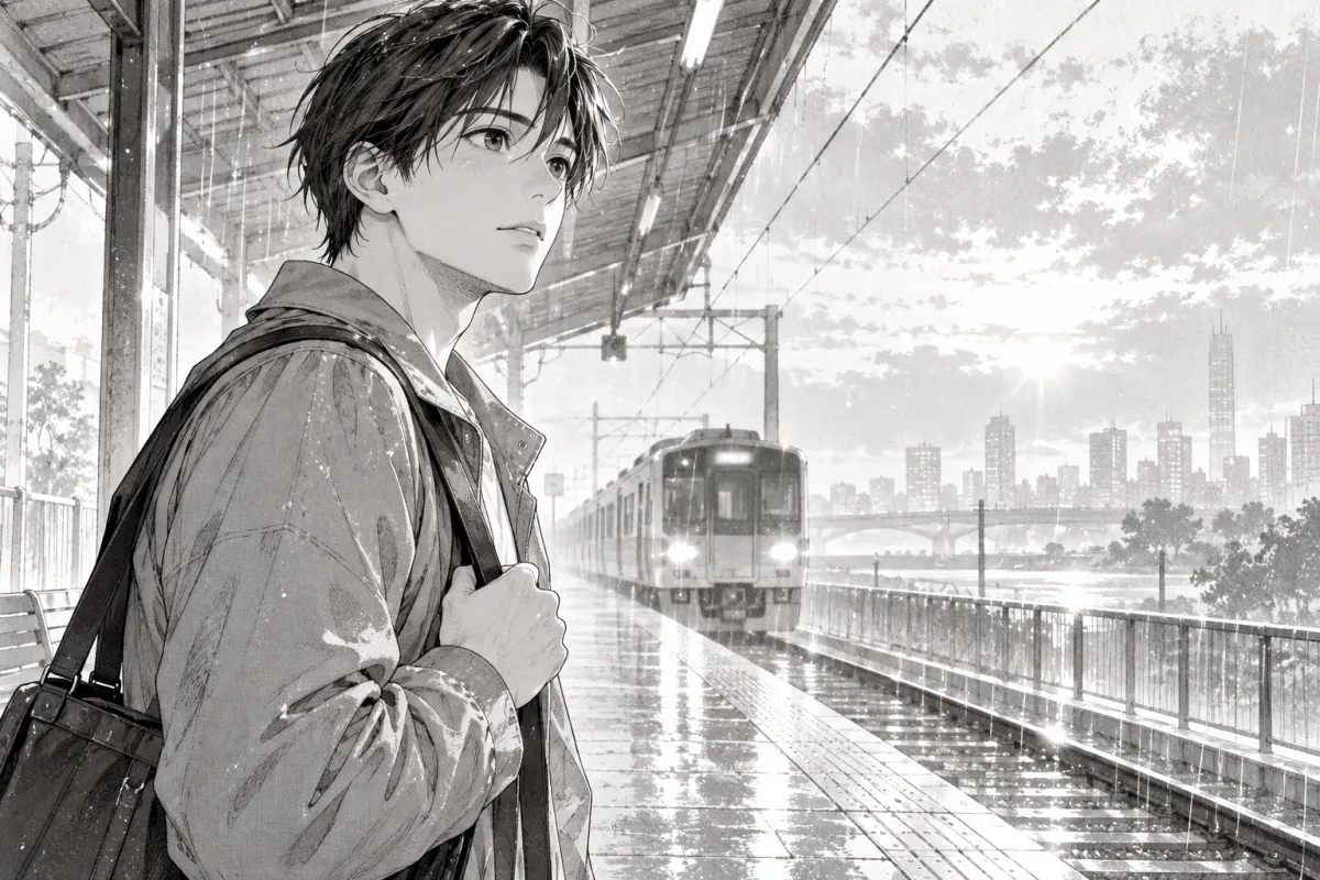
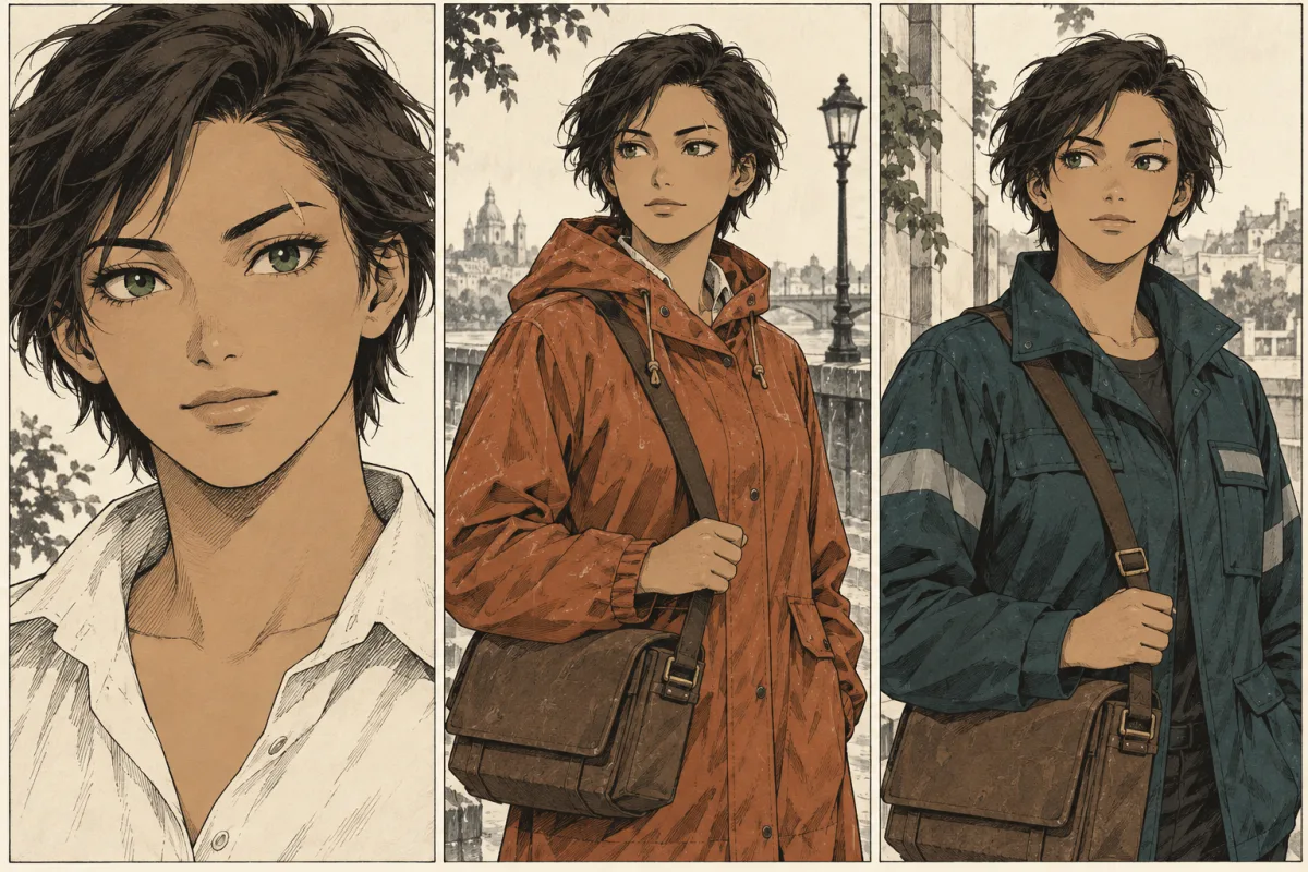
Thin contours, pale tones and an expressive face can make a quiet moment carry the page. Here the eyes and hair receive more attention than the station. This is a useful direction for an intimate conversation or an uncertain decision, whichever audience your manga serves.
Try this for romance, reflective drama or a scene where a small change in expression matters.
Watch for: Very faint lines may disappear on a small screen. Give eyes, mouth and silhouette enough contrast to survive reduction.
Art brief: Fine graceful contours, expressive eyes, pale background tones, airy highlights, intimate framing around the face.
4. Realistic proportions and ink texture
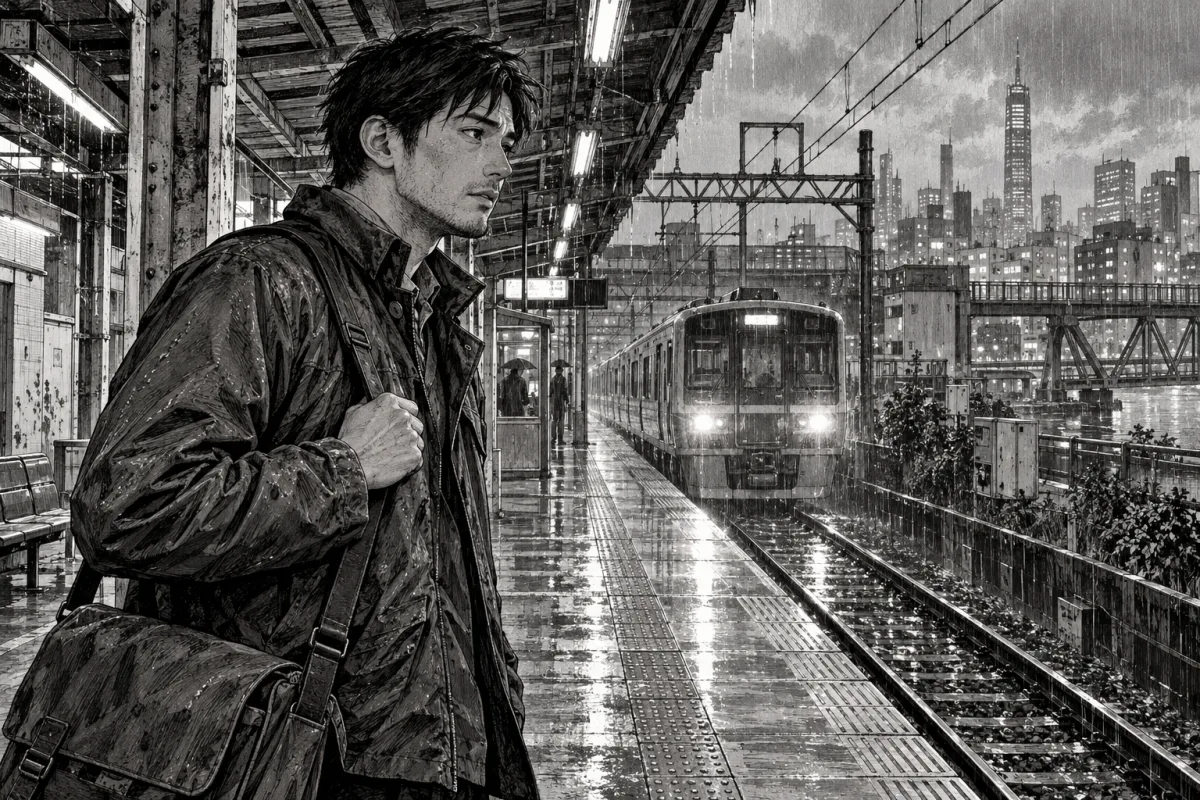
Naturalistic anatomy and dense ink marks give surfaces weight. Hatching uses lines to suggest shade; crosshatching layers lines in different directions. Our example uses facial detail, fabric creases and a worked background to make the station feel inhabited.
Try this for a grounded mystery, historical setting or scene where the physical environment matters.
Watch for: Detailed rendering takes effort to maintain across a chapter. Reserve the richest detail for moments that deserve it, and simplify distant panels.
Art brief: Grounded adult proportions, observed fabric folds, directional hatching, textured architecture, restrained facial exaggeration.
5. Chibi and comic exaggeration
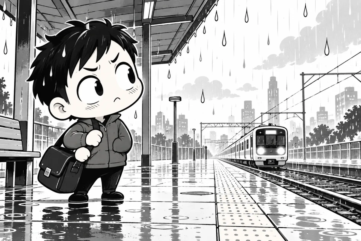
Chibi rendering compresses a character into a small body with an oversized head. Large expressions and simple shapes make the reaction easy to read. You can use it throughout a comedy or briefly switch into it for an embarrassed, frustrated or delighted reaction.
Try this for reaction panels, short comedy or a playful character introduction.
Watch for: A sudden proportion change needs a clear reason in the scene. Keep identifying features such as the hair shape and satchel recognizable.
Art brief: Oversized head, compact rounded body, simplified hands, exaggerated expression, clear playful shapes.
6. Cel-shaded color
Cel shading uses distinct areas of light and shadow with little blending. It is an anime-influenced coloring approach that also works in still illustrations and color comics. The example pairs cool surroundings with warm train lights. Color treatment and page format are separate choices: this image does not make the story an animation or a vertical-scroll comic.
Try this for a color cover, promotional scene or color manga where palette is part of the storytelling.
Watch for: A color palette adds continuity decisions. Record the main colors and check that the focal point remains clear in grayscale.
Art brief: Crisp ink contours, flat local colors, hard-edged shadow planes, cool rainy surroundings, warm amber lights.
Choose a style you can sustain for a chapter
Pick one ordinary scene and test it as a wide shot, a close-up and a dialogue panel. A beautiful single image is only the start. Your style also needs room for lettering, clear expressions and repeated character details.
- Write the feeling you want the scene to carry.
- Choose a line weight, shadow treatment, proportion rule and palette.
- Check the art at the size readers will see it.
- Record details that must repeat, including hair, clothing, props and colors.
- Plan a complete page to see whether the style supports the story's pacing.
Use the character continuity sheet to save your visual notes. Build the scene in the manga script builder, then try a panel layout. The dialogue-fit preview helps you check lettering space before committing to the art.
Working from prose? Read how to make a manga without drawing for ways to develop a chapter with an artist or digital tools.
Common questions
What are the different manga art styles?
Manga artists use many combinations of linework, proportions, screentones, hatching and color. This guide compares clean linework, high-contrast action, delicate expression, realistic texture, chibi comedy and cel-shaded color. These are practical approaches, not an exhaustive taxonomy.
Are shonen and shojo drawing styles?
Shonen and shojo are publishing labels associated with audiences. They can include many genres and drawing styles. A useful art brief describes line weight, proportions, shadows and color separately.
Can a manga use more than one art style?
Yes. For example, a story can switch to chibi proportions for a comic reaction. Keep recurring identifying details recognizable, and make the change serve the scene.
Are these pictures generated by Konyomi?
The pictures are original AI-generated editorial illustrations made for this guide with an image-generation tool. They are not examples from Konyomi's public generation workflow, which remains in early access.
Sources
Konyomi turns a written story into manga. It opens soon.